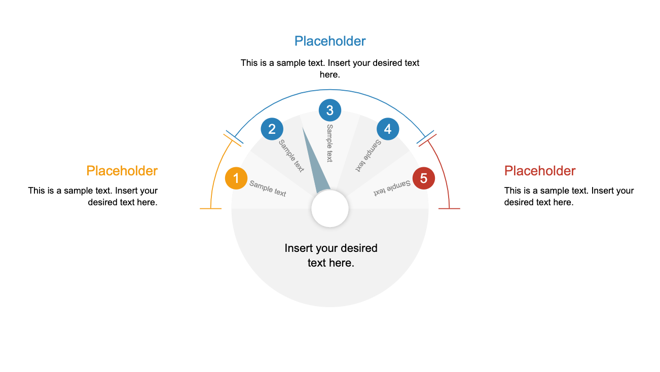
The Simple Gauge Diagram is a customized layout of measuring gauge. It is a business concept PowerPoint, perfect for KPI presentations or performance metrics related topics. It is a creative illustration of speedometer on dashboard that could be used in sales and management presentations. Because it is a metaphor for dashboard which will help discuss insights and efficient way. For example, the pressure gauge can visualize level value of danger or management risks using gauge needle.
The simple gauge diagram template displays up to ten levels in 3 segments to describe low, medium and high levels in performance metrics. The text placeholders available in template will assist users to represent important information about business management strategies. Furthermore, users can easily adjust the needle to a desired position by rotating its pin. The users can also change colors of each shape or apply different color themes and backgrounds if necessary.
The gauge diagram is an easy-to-understand presentation of KPIs to assess performance of business goals.