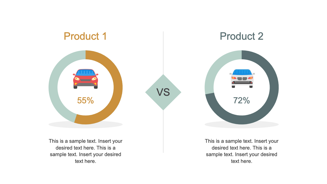
The Product Comparison Diagram is a modern donut chart style presentation. This diagram is helpful to describe the performance and features of two products. Product here could be a device, project, business idea, marketing campaign, etc.
All the shapes and icons in this diagram are editable objects. Users can replace these icons with other shapes to illustrate technical, functional, usability or popularity comparisons.
The most common example of product comparison could be mobile devices. The phone companies launch multiple mobile models every year which can complicate customer’s buying decisions. Therefore, the visual presentation of a comparison between two products will assist customers to make wise decisions. Since every customer has different product needs, the comparison will help preview specifications or pros and cons. This template is simply a way to compare features and product capabilities through one-on-one analysis.